 Main Page
Data Visualization
Breakfast Preference Data
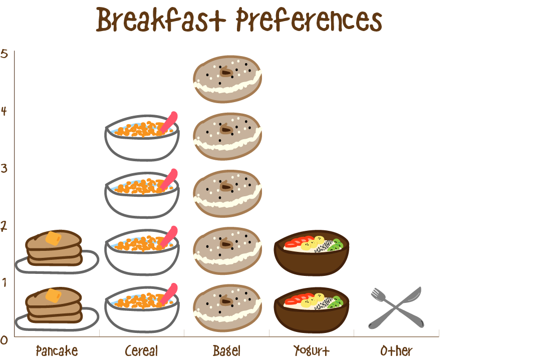
This is a graph of everyone's preferred breakfast. I created my own illustrations of each choice and created a pictograph. This way it is easier to to see which breakfast is more popular.
Movie Snack Preference Data
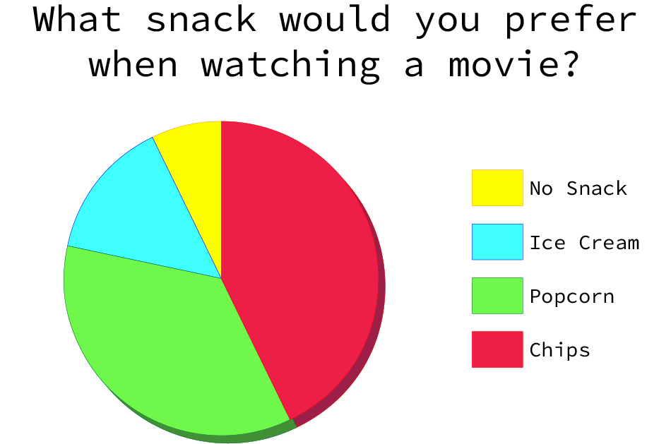
This is a graph of what everyone's preferred movie snack is. I used a pie chart to present this data because it is straight forward and easy to read. I used bright colors to differenciate each choices.