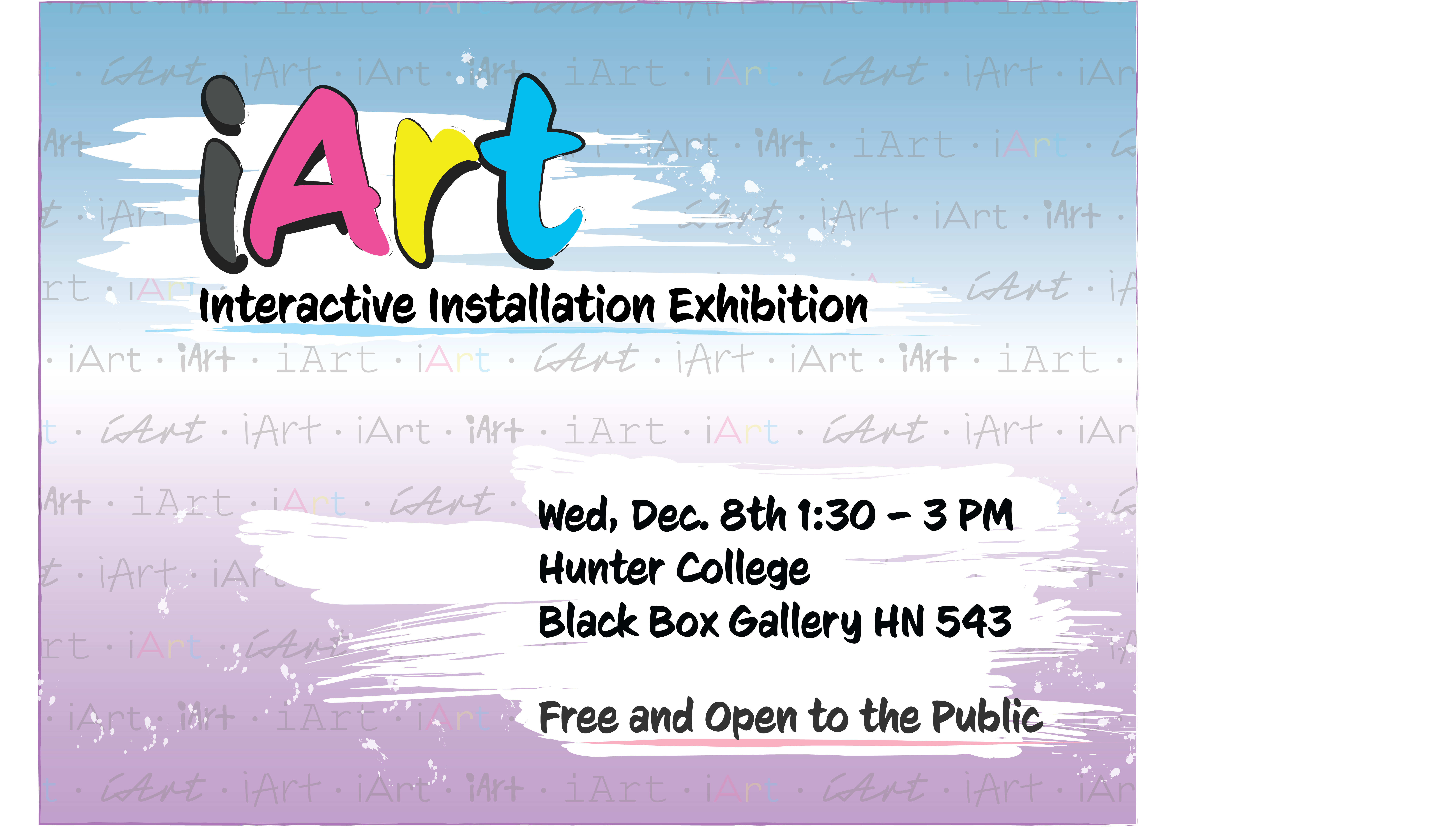
iArt Poster Design

I started this poster design with the concept that there will be a lot of different artwork at the art gallery.To express that, I created a pattern of different typography saying the phrase "iArt" in the background of the poster. Then, I created a gradient background behind the pattern I made previously, going from light blue to white then pink. Next, I used the font CCSignLanguage to present the main content of the poster. I utilized the paint brush and stroke function of Illustrator to make the constent standout. I then explored using tracking, leading, and kerning to change the position of text. Lastly I lowered the opacity of the pattern I first created so the background is not heavier than the main content.
 Main Page