

Death Note has this one character named Mello, a mean, serious, and
Intelligent mafia leader who is ready to solve the mystery of the book
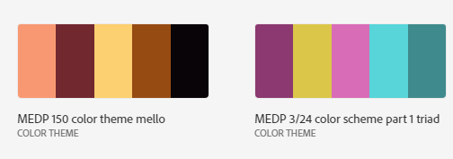
Mello's colors and motif is based off of many movie mafia gang
leaders, however uses lighter colors to symbolize the honesty in him.
Mello is dedicated, and is willing to put his life on the line
to find out who is the owner of the mysterious Death Note and
solve the case before his rival near does
The pattern is based off of this image I used of him:

With this image I captured the hues that define him
I started with the black square as the background of the pattern
The reason black is Mello's outfit usually consists of black hues
and resembles his personality. Mello comes off as cold and strict
like the black, but is much more than he gives off as shown in the
shapes within the pattern as you see. The pink irregular trapezoid
in the top right corner of the square is supposed to ressemble Mellos' scar
that he received in a heist during a major conflict of the story
This is symbolism of the scars and weight it takes on him, an adult
who just only recently is experiencing the hardness of the real
world. The circle on the top right represents Mello's hair, which in
turn represents his intelligent. The hue has a high saturation
and therefore bright. This symbolizes mello's intelligence, and it says he is bright
Unlike his rival Near, Mello is violent, and never hesitant
to fight the people who stands in his way. Nevertheless he breaks the stereotype of
a meathead andalso has critical thinking to his name, being
able to pick up clues and figure out patterns to the perpretrator
The brown star represents religion. In Death Note, there is a
lot of Religious symbolism and comparatives to the catholic and
hebrew bible. While Mello does not resemble any prominent or
Significant figures in the bible, it still is important to the plot points
The darkred hue represents the chocolate he eats throughout the
story, serving as his trademark. I chose this pattern because
I finished binge watching death note a few weeks prior, and I
really wanted to showcase this off at the same time
By incorporating a show i have watched with a school project,
I found I really enjoyed making it and felt less like a chore and more
rewarding on my end. Not to mention, this was more enjoyable to make
than the other one because i did not have to follow a strict or
ideal pattern in order for it to be correct. Instead I just have to
take a preestablished photo on my computer, and put it in the adobe library template
From there I just needed to make slight adjustments, and then
pick out the photos that truly fit mello's character.
I plan to use this to help wrap gift sets, and accessories
such as rings or purses. I also wish to use them in my minecraft
skins to play with my friends in the server, since they do custom builds
Back to Homepage